

Impts
-
Posts
30 -
Cadastrado em
-
Última visita
-
Alguém auxilia numa regra, ao rolar o scroll a partir do ponto 0, ativa regra css, e ao voltar pro ponto 0, desativa a regra.
-
As vezes acontece isso comigo, muda o nome da pasta e tenta
-
Estou começando a aprender C#, sempre tive curiosidade de saber como é feito esse processo de banco de dados: por exemplo, eu vou tentar fazer uma aplicação para desktop Windows que salva informações pessoais de alguém, cpf, rg, e endereço… a curiosidade e o seguinte, como as empresas fazem para logar no programa com o cadastro que você fez no site dela, e apos logado, como e o processo de sincronizar as informações que o usuário salva no programa num banco de dados? O banco de dados e na nuvem, essas coisas?
-
Consegui, o erro foi a chamada do arquivo, tipos como javascript você tem que chamar ele dentro do <body> mesmo? Não pode ser igual o css dentro do <head>? <script src="script.js"></script>
-
@Marlon Vinicius Cardoso Não funcionou também, consegue identificar erro no javascript?
-
Quando clico no botão ao reduzir a página apra 600px, ele não abre as opções do media... <header id="header"> <nav id="nav"> <button id="btn-mobile">Menu</button> <ul id="opcion-nav"> <li><a id="logo" href="">Logo</a></li> <li><a href="">Menu</a></li> <li><a href="">Menu</a></li> <li><a href="">Menu</a></li> <li><a href="">Menu</a></li> <li><a href="">Menu</a></li> </ul> </nav> </header> body, ul { margin: 0; padding: 0; } #nav li a { color: white; text-decoration: none; font-family: sans-serif; } #header { box-sizing: border-box; height: 50px; padding: 1rem; display: flex; background-color: gold; justify-content: center; } #opcion-nav { display: flex; gap: .9rem; list-style: none; } #btn-mobile { display: none; } @media (max-width: 600px) { #btn-mobile { display: block; } #opcion-nav { display: block; position: absolute; width: 100%; top: 50px; right: 0px; background-color: grey; display: block; height: 0px; transition: .6s; z-index: 1000; visibility: hidden; overflow: hidden; } #nav.active #opcion-nav { height: calc(100vh - 50px); visibility: visible; overflow: auto; } #nav li a { padding: 1rem 0; margin: 0 1rem; border-bottom: 2px solid RGB(0, 0, 0, 05); } } const btnMobile = document.getelementbyid('btn-mobile'); function toggleMenu(){ const nav = document.getelementbyid('nav'); nav.classlist.toggle('active') } btnMobile.addeventlistener('click', toggleMenu);
-
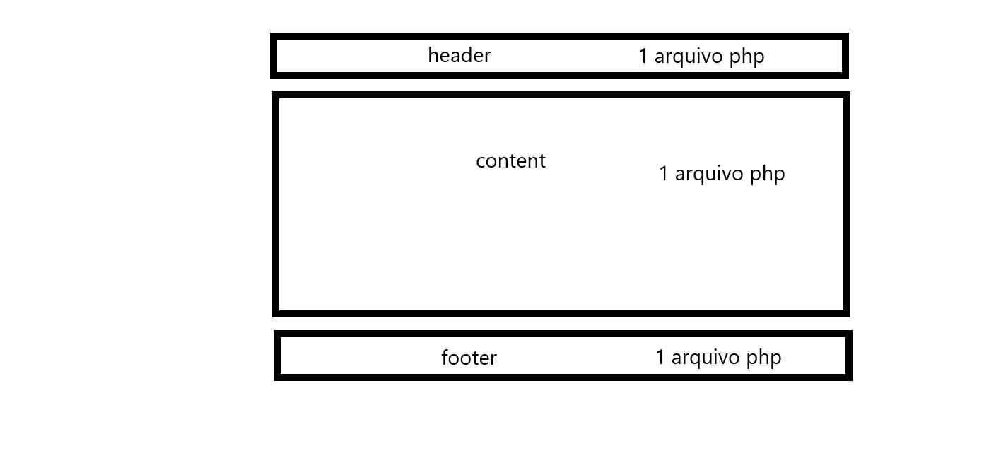
PHP Qual é o jeito certo de fazer divisão por página php?
Impts respondeu ao tópico de Impts em Web e banco de dados
Eu até consegui fazer o que eu queria, mas não sei se é o jeito certo mesmo, eu usei um sistema básico de grid, alguns problemas surgiram, como, o menu não fica na posição certa quando uso (position:fixed), para quando rolar a página, ele desça junto... e o rodapé ficou fixo na página e não no fim dela como deveria.... header.php <header> <div class="menu"> <nav> <ul> <li><a href="index.php" class="link-logo"></a></li> <li><a href="">Informação</a></li> <li><a href="">Informação</a></li> <li><a href="">Informação</a></li> <li><a href="">Informação</a></li> <li><a href="">Informação</a></li> <li><a href="">Informação</a></li> <li><a href="">Informação</a></li> <li><a href="" class="link-search"></a></li> <li><a href="" class="link-bag"></a></li> </ul> </nav> </div> </header> header { display: grid; background: yellow; } .menu { display: inline-block; flex-wrap: wrap; justify-content: space-between; margin: 0 auto; height: 50px; max-width: 100%; backdrop-filter: blur(0.5vh); } nav { height: 100%; flex-basis: calc(120% - 10vh); display: flex; text-align: center; margin: 0 auto; justify-content: center; height: 100%; } .menu ul { flex-basis: 100%; display: flex; justify-content: space-between; align-items: center; } .menu li{ list-style-type:none; } .menu li a { padding: 0.5vh 2vh; color: #000; text-decoration: none; font-size: 12px; opacity: 10; transition: opacity 400ms; } .menu li a:hover { opacity: 0.4; text-decoration: none; } .link-logo { background: url('logotipo-header.png'); background-repeat: no-repeat; display: flex; background-size: 3vh; height: 5vh; width: 3.5vh; background-position: center; } .link-bag { background: url('bag-header.png'); background-repeat: no-repeat; display: flex; background-size: 2vh; height: 5vh; width: 3.5vh; background-position: center; } .link-search { background: url('search-header.png'); background-repeat: no-repeat; display: flex; background-size: 2vh; height: 5vh; width: 3.5vh; background-position: center; opacity: 10; } Content.php <content> <p>Lorem Ipsum is simply dummy text of the printing and typesetting industry. Lorem Ipsum has been the industry's standard dummy text ever since the 1500s, when an unknown printer took a galley of type and scrambled it to make a type specimen book. It has survived not only five centuries, but also the leap into electronic typesetting, remaining essentially unchanged. It was popularised in the 1960s with the release of Letraset sheets containing Lorem Ipsum passages, and more recently with desktop publishing software like Aldus PageMaker including versions of Lorem Ipsum.</p> <p>Lorem Ipsum is simply dummy text of the printing and typesetting industry. Lorem Ipsum has been the industry's standard dummy text ever since the 1500s, when an unknown printer took a galley of type and scrambled it to make a type specimen book. It has survived not only five centuries, but also the leap into electronic typesetting, remaining essentially unchanged. It was popularised in the 1960s with the release of Letraset sheets containing Lorem Ipsum passages, and more recently with desktop publishing software like Aldus PageMaker including versions of Lorem Ipsum.</p> <p>Lorem Ipsum is simply dummy text of the printing and typesetting industry. Lorem Ipsum has been the industry's standard dummy text ever since the 1500s, when an unknown printer took a galley of type and scrambled it to make a type specimen book. It has survived not only five centuries, but also the leap into electronic typesetting, remaining essentially unchanged. It was popularised in the 1960s with the release of Letraset sheets containing Lorem Ipsum passages, and more recently with desktop publishing software like Aldus PageMaker including versions of Lorem Ipsum.</p> <p>Lorem Ipsum is simply dummy text of the printing and typesetting industry. Lorem Ipsum has been the industry's standard dummy text ever since the 1500s, when an unknown printer took a galley of type and scrambled it to make a type specimen book. It has survived not only five centuries, but also the leap into electronic typesetting, remaining essentially unchanged. It was popularised in the 1960s with the release of Letraset sheets containing Lorem Ipsum passages, and more recently with desktop publishing software like Aldus PageMaker including versions of Lorem Ipsum.</p> <p>Lorem Ipsum is simply dummy text of the printing and typesetting industry. Lorem Ipsum has been the industry's standard dummy text ever since the 1500s, when an unknown printer took a galley of type and scrambled it to make a type specimen book. It has survived not only five centuries, but also the leap into electronic typesetting, remaining essentially unchanged. It was popularised in the 1960s with the release of Letraset sheets containing Lorem Ipsum passages, and more recently with desktop publishing software like Aldus PageMaker including versions of Lorem Ipsum.</p> <p>Lorem Ipsum is simply dummy text of the printing and typesetting industry. Lorem Ipsum has been the industry's standard dummy text ever since the 1500s, when an unknown printer took a galley of type and scrambled it to make a type specimen book. It has survived not only five centuries, but also the leap into electronic typesetting, remaining essentially unchanged. It was popularised in the 1960s with the release of Letraset sheets containing Lorem Ipsum passages, and more recently with desktop publishing software like Aldus PageMaker including versions of Lorem Ipsum.</p> <p>Lorem Ipsum is simply dummy text of the printing and typesetting industry. Lorem Ipsum has been the industry's standard dummy text ever since the 1500s, when an unknown printer took a galley of type and scrambled it to make a type specimen book. It has survived not only five centuries, but also the leap into electronic typesetting, remaining essentially unchanged. It was popularised in the 1960s with the release of Letraset sheets containing Lorem Ipsum passages, and more recently with desktop publishing software like Aldus PageMaker including versions of Lorem Ipsum.</p> <p>Lorem Ipsum is simply dummy text of the printing and typesetting industry. Lorem Ipsum has been the industry's standard dummy text ever since the 1500s, when an unknown printer took a galley of type and scrambled it to make a type specimen book. It has survived not only five centuries, but also the leap into electronic typesetting, remaining essentially unchanged. It was popularised in the 1960s with the release of Letraset sheets containing Lorem Ipsum passages, and more recently with desktop publishing software like Aldus PageMaker including versions of Lorem Ipsum.</p> </content> content {display: grid; grid-template-columns: 1fr; grid-template-rows: 1fr; grid-column-gap: 0px; grid-row-gap: 0px; background-color: darkred; height: 100%; font-size: 24px;} Footer.php <footer> <section class="footer3"> <div class="footer3-item"> <p class="infofooter">Copyright © 2022 Empresa. Todos os direitos reservados.<!-- Empresa Ltda.--> CNPJ: 00.000.000/0000-35</p> <p><a href="">Política de Privacidade</a> • <a href="">Política de vendas</a> • <a href="">Avisos legais</a> • <a href="">Mapa do site</a></p> </div> </section> </footer> footer { bottom: 0; background: rgba(0,0,0,0.8); color: white; width: 100%; position: fixed; } footer a {color: #dcdcdc; opacity: 10; opacity: 0.8;transition: opacity 400ms;} footer a:link{text-decoration: none; color: white;} footer a:visible{text-decoration: none; color: white;} footer a:hover{text-decoration: underline; color: white; opacity: 0.8;} .infofooter {opacity: 0.8; transition: opacity 400ms;} .footer3 { display: grid; grid-template-columns: repeat(1, 1fr); grid-gap: 2vh; margin: 0 auto; max-width: 175vh; padding: 5vh; align-items: center; } .footer3-item { text-align: center; max-height: 3vh; } -
PHP Qual é o jeito certo de fazer divisão por página php?
Impts postou um tópico em Web e banco de dados
Qual é o jeito certo de fazer um site com várias partes dividida em php sem conflitar com seus objetos? Por exemplo, eu estou tentando fazer 1 arquivo php que vai ser o HEADER, 1 arquivo php que vai ser o CONTENT e 1 arquivo php que vai ser o FOOTER.... porém o Content sempre conflita com o header quando puxo ele na pagina INDEX. O conteúdo do content sobrepoe o header, como é feito para obedecer a ordem e ficar abaixo? Alguém pode demonstrar de forma básica, ou mandar um tutorial do que eu preciso? <!DOCTYPE html> <html lang="pt-br"> <head> <meta charset="UTF-8" /> <meta name="Author" content="" /> <meta name="viewport" content="width=device-width, initial-scale=1.0" /> <meta http-equiv="X-UA-Compatible" content="ie=edge" /> <link rel="shortcut icon" href="./img/favicon.ico" /> <link rel="stylesheet" type="text/css" href="./css/globalstyle.css" media="" /> <title>Projeto</title> </head> <body> <?php require_once('header.php'); require_once('content.php'); require_once('footer.php'); ?> </body> </html>
-
Eu estou tentando fazer com que fique 3 caixas na horizontal de onde vai ficar a foto, porém, não estou conseguindo alinhar, vou deixar uma foto de como eu queria que ficasse. <section class="grid1"> <div class="grid1-item"> <img src="./img/foto1.png"> </div> <div class="grid1-item"> <p><h1>Titulo 1</h1></p> <p>Descrição</p> <p><a href="">Link</a></p> </div> <div class="grid1-item"> <p><h1>Titulo 1</h1></p> <p>Descrição</p> <p><a href="">Link</a></p> </div> <div class="grid1-item"> <p><h1>Titulo 1</h1></p> <p>Descrição</p> <p><a href="">Link</a></p> </div> </section> .grid1 { display: grid; grid-template-columns: repeat(3, 1fr); grid-gap: 20px; margin: 0 auto; max-width: 175vh; padding: 5vh; } .grid1-item:nth-child(1) { grid-row: 1 / 3; background: black; } .grid1-item { display: grid; } .grid1-item img { grid-column: 1; grid-row: 1/3; align-self: end; } .grid1-item p { background: red; padding: 25px; color: white; grid-column: 1; grid-row: 3; align-self: end; height: 10px; }
-
CSS Qual é a ordem de posicionamento para alinhar o menu dentro de div? HTML/CSS
Impts respondeu ao tópico de Impts em Web e banco de dados
Outra dúvida, como conserto o alinhamento quando coloco uma imagem dentro do <li>? Coloquei o logo, e as demais opções desceram, não ficaram alinhadas com a imagem. header { display: flex; flex-wrap: wrap; justify-content: center; background: floralwhite; height: 5vh; width: 100%; backdrop-filter: blur(7px); } .menuwrap {} .menu {} .menu ul {} .menu li{display: inline-block; padding: 0vh 1.5vh;} .link-logo { background: url('logo.png'); background-repeat: no-repeat; display: inline-block; background-size: 3vh; height: 5vh; width: 3.5vh; } <header> <div class="menuwrap"> <div class="menu"> <nav> <ul> <li><a href="" class="link-logo"></a></li> <li><a href="">Produto</a></li> <li><a href="">Produto</a></li> <li><a href="">Produto</a></li> <li><a href="">Produto</a></li> <li><a href="">Produto</a></li> <li><a href="">Produto</a></li> </ul> </nav> </div> </div> </header>
-
CSS Qual é a ordem de posicionamento para alinhar o menu dentro de div? HTML/CSS
Impts postou um tópico em Web e banco de dados
Estou tentando alinhar um menu dentro do header, e dentro do header tem 2 div, qual a ordem de respeito das funções? Deve-se alinhar o menu dentro do header utilizando só a div menuwrap, ou a div menu? ou o alinhamento se da dentro do header? <header> <div class="menuwrap"> <div class="menu"> <nav> <ul> <li><a href="">Produto</a></li> <li><a href="">Produto</a></li> <li><a href="">Produto</a></li> <li><a href="">Produto</a></li> <li><a href="">Produto</a></li> <li><a href="">Produto</a></li> <li><a href="">Produto</a></li> <li><a href="">Produto</a></li> <li><a href="">Produto</a></li> <li><a href="">Produto</a></li> </ul> </nav> </div> </div> </header> body {margin: 0; padding: 0;} header { display: flex; flex-wrap: wrap; justify-content: space-between; height: 5vh; background: red; } .menuwrap {} .menu {} .menu ul {} .menu li{display: inline-block;} -
CSS Conflito de form input, como classificar para resolver?
Impts postou um tópico em Web e banco de dados
Um form esta dando conflito com outro devido sua estilização css, só que não consigo setar de forma diferente pra não dar conflito. Tentei usar id e no css colocar #specialloginform >form e nada.... <form action="<?= htmlspecialchars($_SERVER["PHP_SELF"]) ?>" method="POST" id="specialloginform"> <h1 class="titleformlogin">Por favor, faça login.</h1> <fieldset> <input value="<?= $data['email'] ?>" autocomplete="username" name="email" type="text" placeholder="E-mail" > <div id="msg-errors"> <?php if (isset($errors['email'])): ?> <?= $errors['email'] ?> <?php endif; ?> </div> <input autocomplete="current-password" name="password" type="password" placeholder="Senha" > <div id="msg-errors"> <p> <?php if (isset($errors['password'])): ?> <?= $errors['password'] ?> <?php endif; ?> </p> </div> <span class="descriptionID">É necessário inserir seu email.</span> <input type="submit" value="Entrar" class="btnlogin"> <p class="descriptionpass"><a href="">Esqueceu a sua senha?</a></p> <p class="descriptionpass"><a href="">Crie uma conta</a></p> </fieldset> </form> form {max-width: 50vh;padding: 2em;border-radius: 0.5em;transition: 0.2s;box-shadow: 1px 1px 5px #777;background: #fff;width: calc(100% - 20px);} /*input[type="text"], input[type="password"] {text-shadow: black;}*/ input {width: 100%;display: block;margin: 1em 0;padding: 12px;} -
O problema é o seguinte, estou ali, fazendo os projetos tranquilo, atualizando as paginas na web, e do nada, eu mudo os codigos na IDE, e atualizo a pagina, nenhuma atualização é enviada mais, simplesmente para de funcionar do nada, é algum problema do xampp? Eu reinicio o Xampp, não resolve, só reiniciando o PC
-
@GabrielSennaMs desculpa reviver o tópico, mas, esse erro que você coloca, no titulo, como eu faço para inserir embaixo do input? o erro de email embaixo do input <?php if (count($errors) > 0): ?> <?= implode("", array_values($errors)); ?> <?php endif; ?> de email e o outro da senha?
-
@washalbano Acho que consegui resolver, outra coisa, você entende bem de css? Segue essa dúvida: https://www.clubedohardware.com.br/forums/topic/1576130-melhorar-código-de-input-com-transição-para-img/#comment-8317451


Sobre o Clube do Hardware
No ar desde 1996, o Clube do Hardware é uma das maiores, mais antigas e mais respeitadas comunidades sobre tecnologia do Brasil. Leia mais
Direitos autorais
Não permitimos a cópia ou reprodução do conteúdo do nosso site, fórum, newsletters e redes sociais, mesmo citando-se a fonte. Leia mais